Logo Design
Velusso
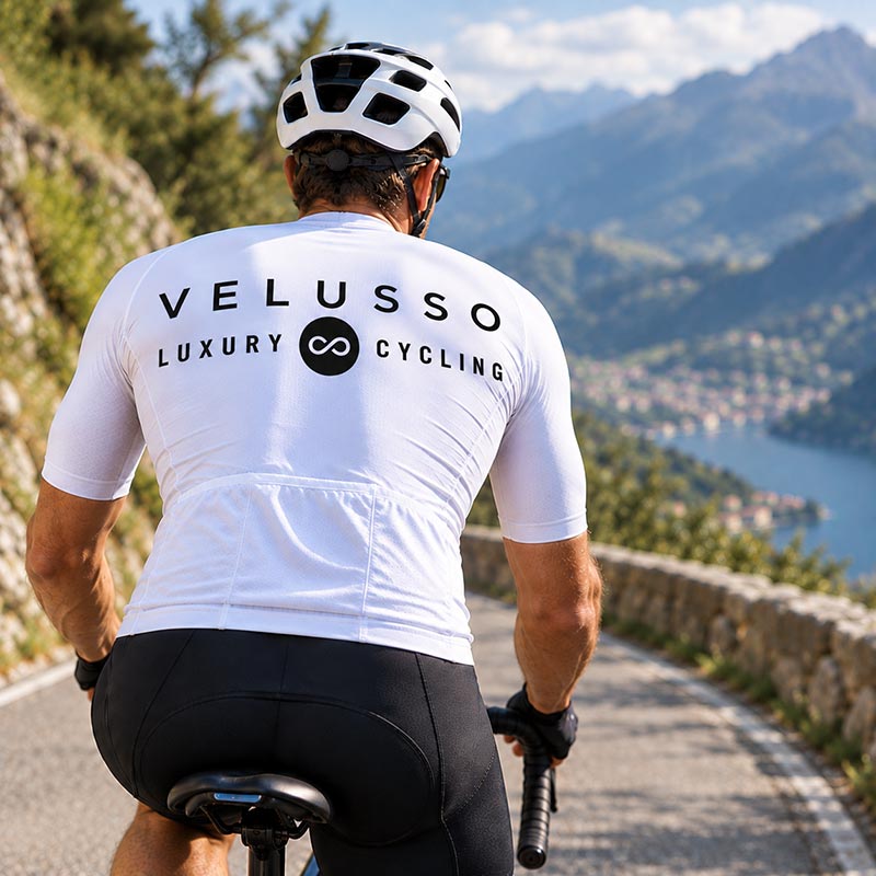
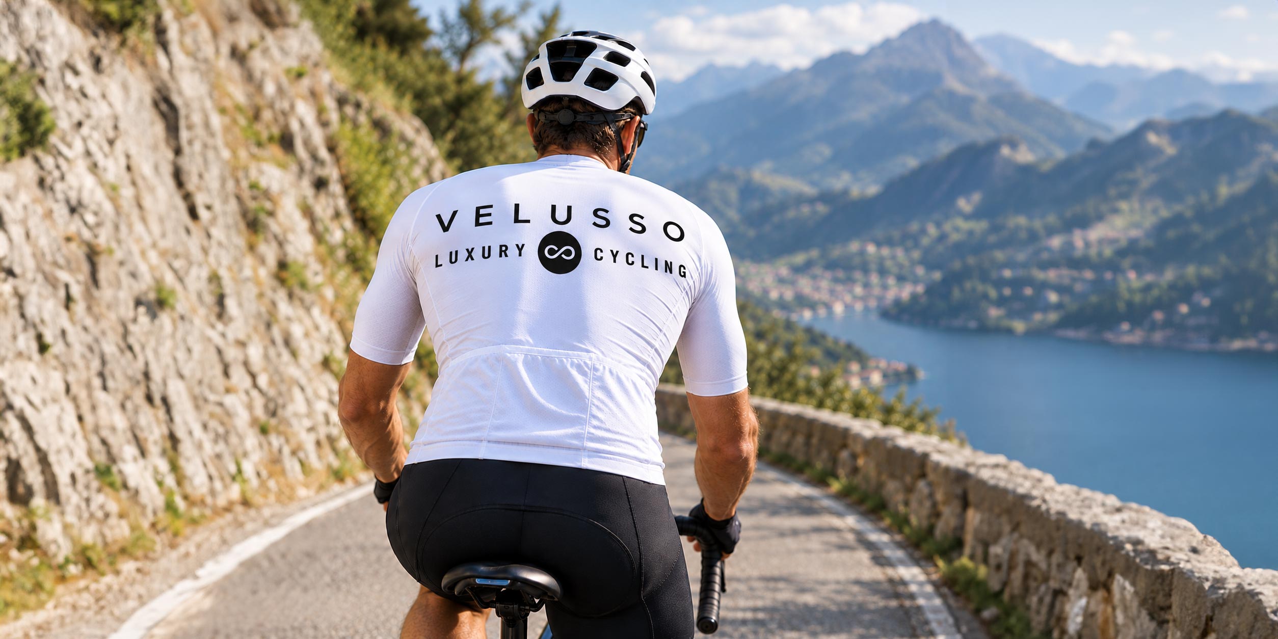
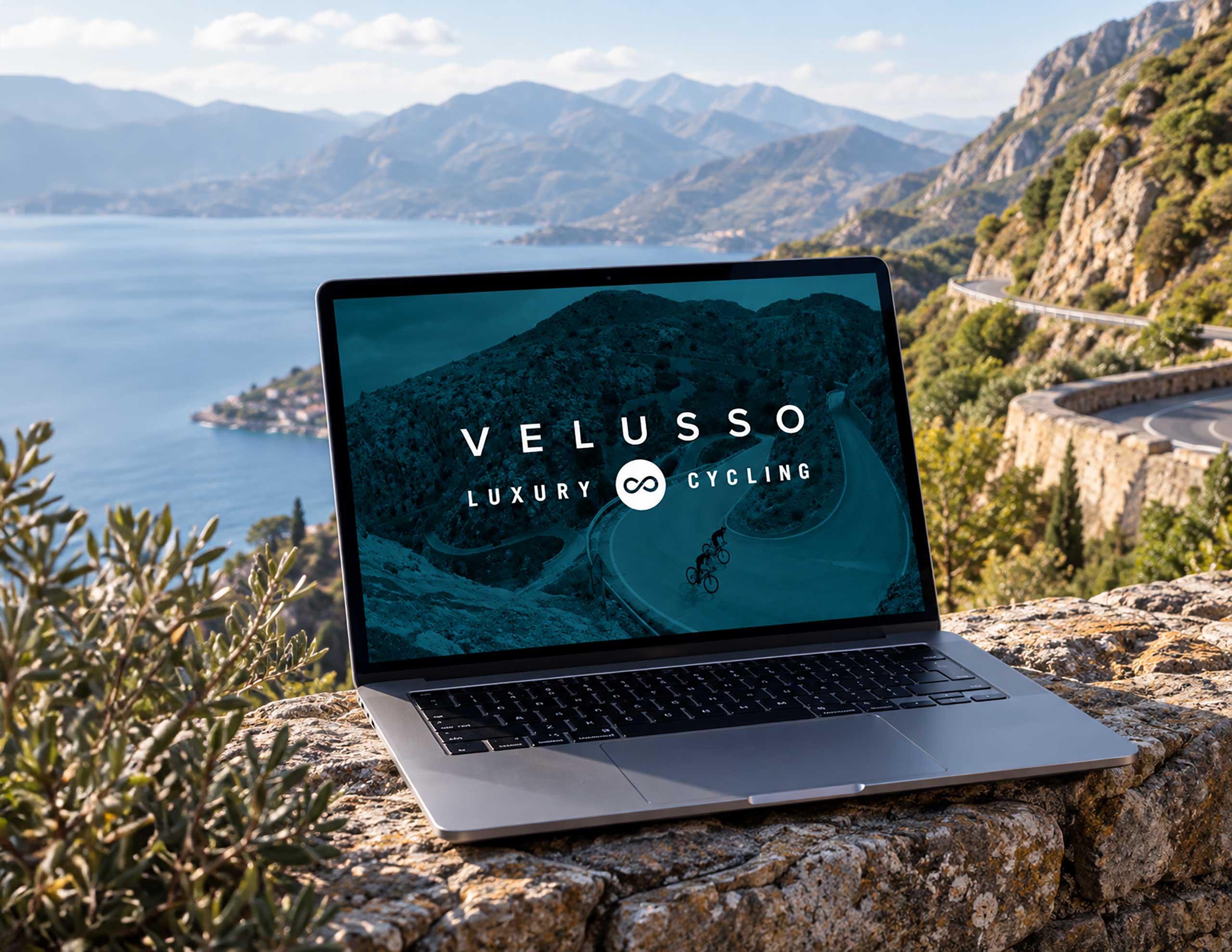
Velusso needed a distinctive identity that captured the movement and excitement of their luxury cycling holiday experiences.
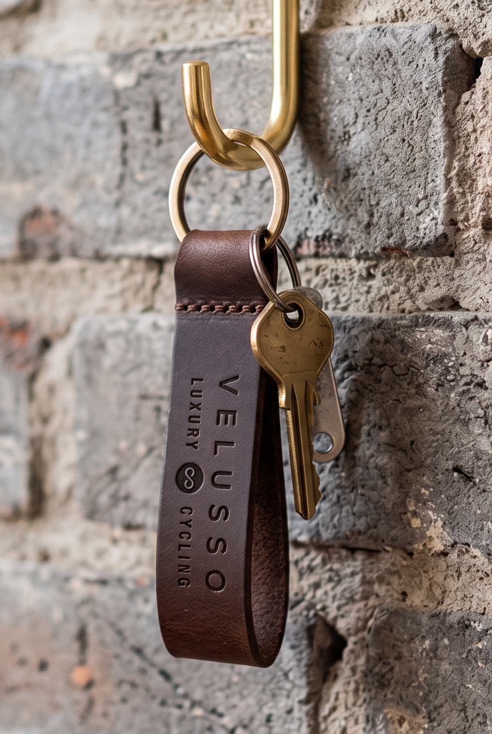
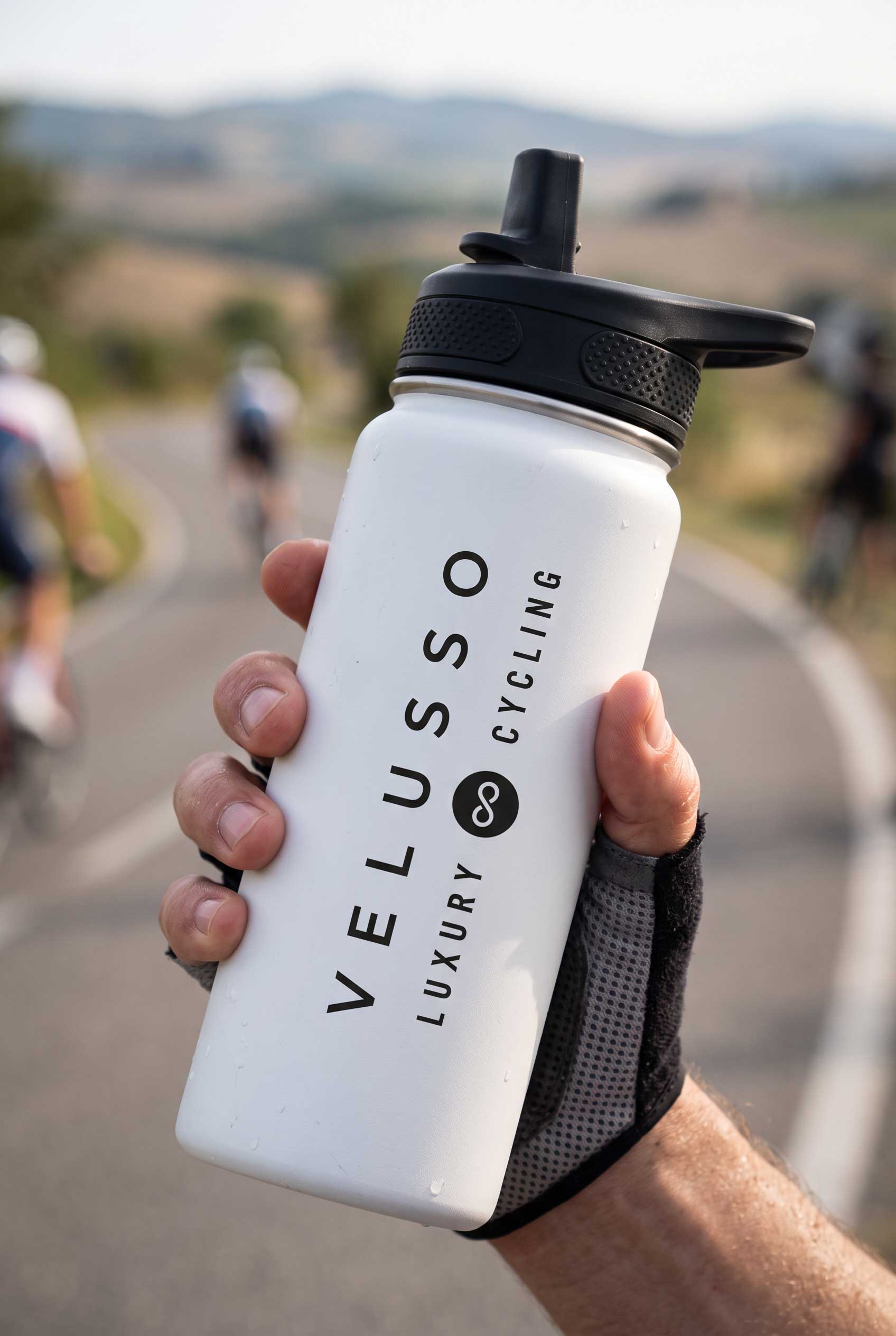
Velusso is a lovely word to say, it flows beautifully off the tongue thanks to the two ‘S’es. I started looking at how I could utilise the two ‘S’es in a way that reflects the qualities of the business. The two ‘S’s in Velusso became the starting point for the concept. When layered and flipped, they form an ‘8’, which when rotated becomes an infinity symbol. I developed this into a bespoke mark, creating a sense of movement while retaining the suggestion of an ‘S’.
The resulting symbol represents movement, completeness and continuity, while also evoking a cycling route or round trip. It reflects the entire Velusso customer journey, the lasting memories created along the way, and the idea of returning for future adventures.
Hire Me
Get in touch to start your next design project!
Whether you're starting a new business or looking to take your existing business to the next level, I'd love to hear from you.
lewis@the-graphic-designer.co.uk
07981539058