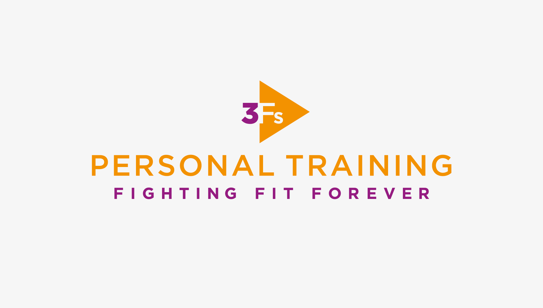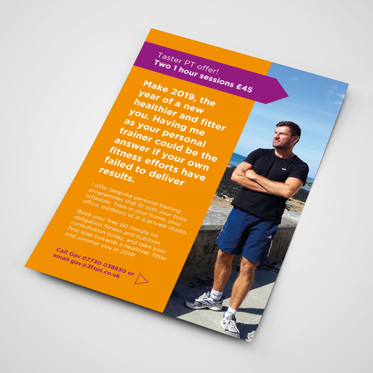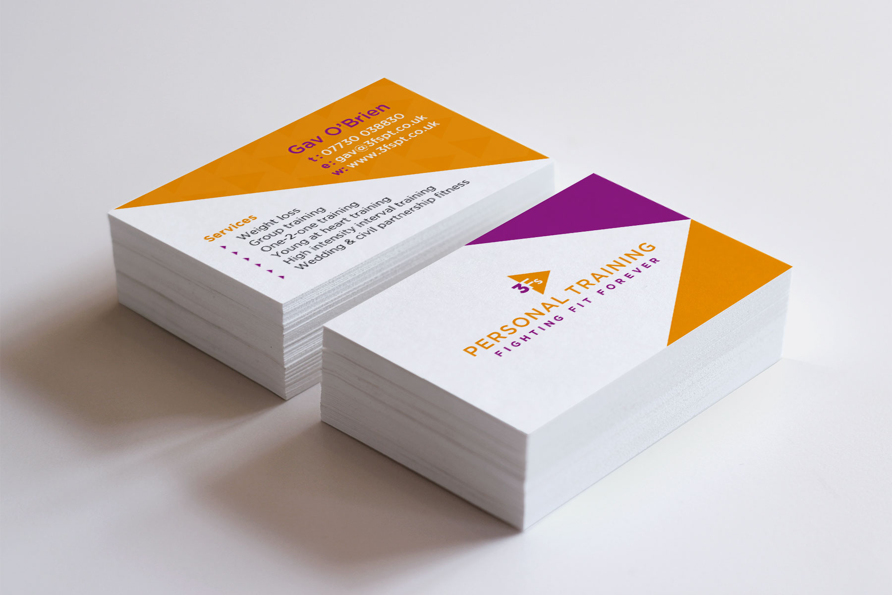


My client, at the age of 50, decided to make the bold move to leave his office days behind and to train as a personal trainer. He initially requested a purely typographic logo for his new business, but whilst sketching out some initial ideas it became obvious which route this logo should take. The triangle has 3 sides and 3 points reinforcing the 3Fs of the Personal Training ethos ‘Fighting Fit Forever’. Furthermore the triangle is the strongest shape as it allows force to be evenly distributed throughout its 3 sides. This is echoed by the fact that 3Fs Personal Training strive to help their clients achieve their best possible fitness by getting into shape or to put it another way achieve their ’strongest shape’, much like the triangle.
In addition, the triangle when rotated, becomes the icon commonly associated with ‘play’ or ‘action’. The triangle when viewed as this simplistic arrow, ties in nicely with the physical nature of getting fit, to take ‘action’ and to get the body moving. After all, “Movement is life”.
The use of strong complimentary colours (purple and orange) creates a bold eye catching logo which compliments the clients enthusiasm for exercise.
