21st Century Fox Logo by Pentagram
Michael Gericke and Emily Oberman of the design agency Pentagram have just designed the new logo for 21st Century Fox, a new brand of 20th Century Fox that represents the media and entertainment divisions such as the cable and broadcasting networks.

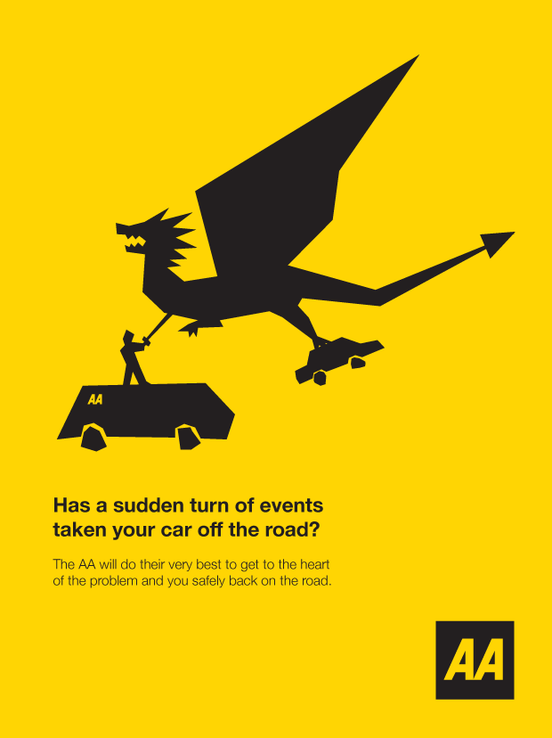
Competition entry for the AA
I was just browsing my hard drive and thought I would share this. It was a competition entry that I did several years ago for the AA. The brief was to simply create a fresh and exciting marketing campaign. I kept the design very simple with simplistic vector illustrations made up of straight lines. The colour palette was literally just the AA colours, black and yellow. The idea behind the posters was to create fun and exciting ways in which the customer’s car had been taken off the road. A normal break down is very boring so I thought ‘what if it was something highly exciting instead’. The AA mechanic can play the hero and come to the driver’s rescue in an almost fairy tale unfolding of events. The copy was short and sweet and I wanted it to incorporate a bit of word play. I never got around to submitting it in the end which is a shame, but here it is now.

How to use keywords and where to put them
Keywords and key phrases are one of the most important elements of SEO. They are words which you have carefully selected and integrated allowing your website to appear in search results when those words are searched. For example one of my key phrases is ‘graphic designer brighton’. I make sure that this key phrase appears in a number of places which I will go on to discuss below.
Be aware of keyword stuffing, this is when you use too many keywords in an unnatural way. Search engines such as Google will see this as spamming and will penalise your website.
1. Keywords in page titles
The page title is the text that typically appears above the browser’s address bar. It is one of the most important things to consider for key word related SEO and is also the first thing you see in a google search result. By putting your keyword first in your title before any other words you can potentially be ranked higher in a search result.

7 tips for choosing your host
There are a number of factors to take into consideration when choosing your web hosting. Here are 7 tips and suggestions that may help you make a better decision.
1. Server location
The location of the host’s server may not seem that important but it does actually affect SEO. For example if you are based in the UK and your website is promoting your UK business then ideally the server that hosts your site should also be in the UK. When Google generates a search result it takes into account the server location as it believes it to be more relevant for those searching. For example if someone searched for a ‘Graphic Designer in London’ then a London based graphic designer who is hosted in the UK may fare better than his or her local competitor who is hosted in America. Of course there are many other things to take into consideration for good SEO.
So, always check where the servers are located. If it’s a large hosting company they will usually have servers in different countries but not always in the country that you need so it’s worth checking before purchasing.

What makes a good logo?
I don’t think a day has gone by that I haven’t seen a logo in some shape or form, they are literally everywhere. In fact one of my earliest memories featured a particular brand of orange squash and it was the logo and the shape of the bottle that I remember (I do have better memories than that but I’m just making a point). Logos are a company’s signature or stamp to let us know that they are here, but what makes some logos work better than others and what makes a successful logo?
1. It must be simple and memorable.
The very best logos throughout history have been simple designs; easily recognisable and easily remembered. Take for example the Nike swoosh or the McDonalds famous golden arches, both easy to visualise and both easy to replicate by hand. I can remember the kids in my school drawing the Nike swoosh on their text books, one crazy individual even had it cut into the back of his hair.
With many of these simple and memorable logos they work just as well without their written name. Again the Nike and McDonalds logos are good examples but so are many others. Take for example the Apple logo, it appears more often than not as a stand alone icon of an apple, no description necessary. Facebook is often seen as a white ‘F’ on a blue square.

What are the dimensions of the different paper sizes?
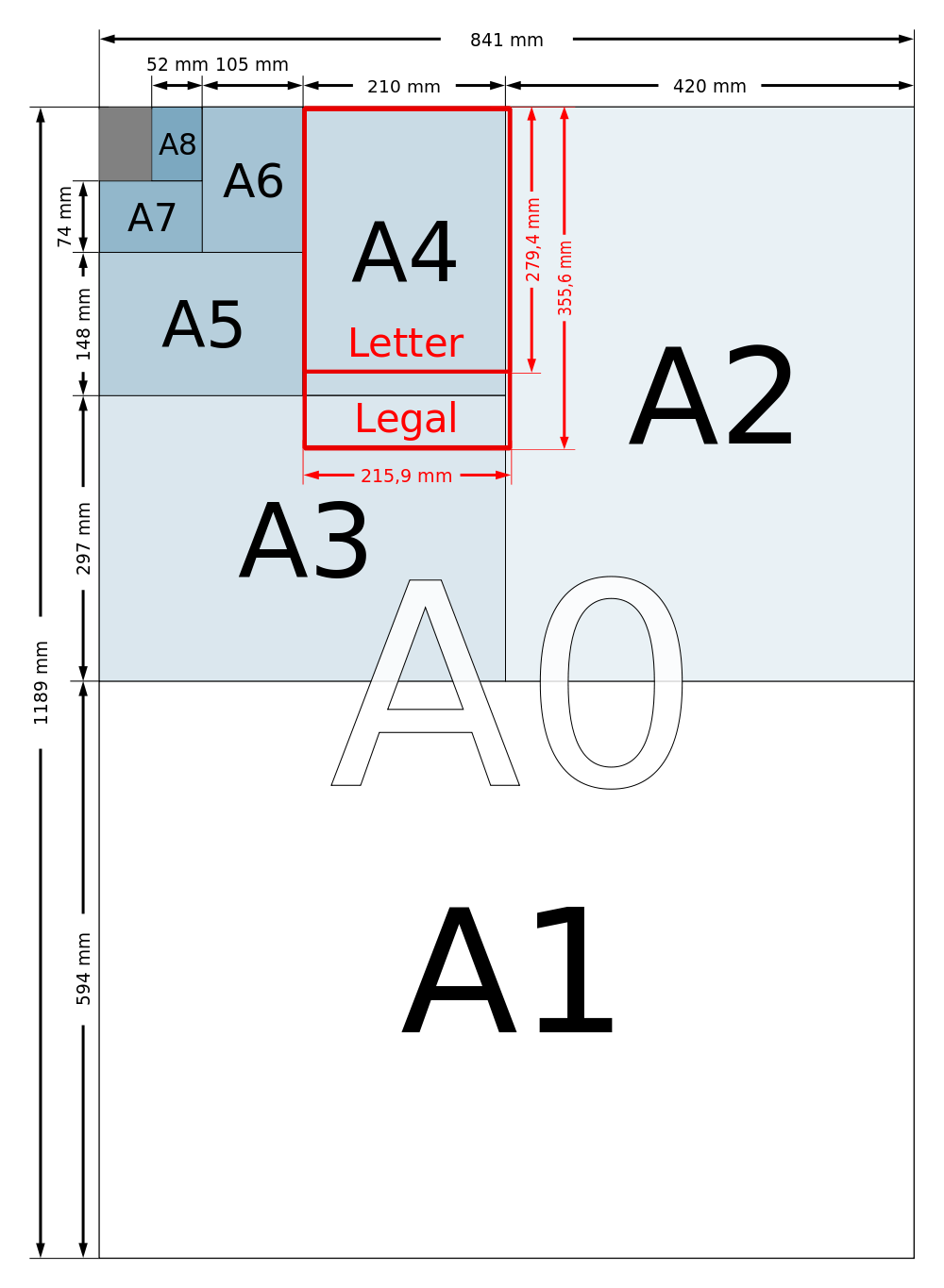
A4 is seriously popular in the world of paper, the other sizes probably get a bit jealous at times, I mean when was the last time you saw a paper airplane made from anything but A4. It is certainly the standard size for most things from printers and scanners to paper based aeronautics. But have you ever wondered what the exact dimensions of a piece of A4 paper are? What about A0? Well its your lucky day. Below are a list of the paper sizes from A10 through to A0. What a treat!
A9: 37 mm x 52.5 mm
A8: 52.5 mm x 74 mm
A7: 74 mm x 105 mm
A6: 105 mm x 148 mm
A5: 148 mm x 210 mm
A4: 210 mm x 297 mm
A3: 297 mm x 420 mm
A2: 420 mm x 594 mm
A1: 594 mm x 841 mm
A0: 841 mm x 1189 mm


