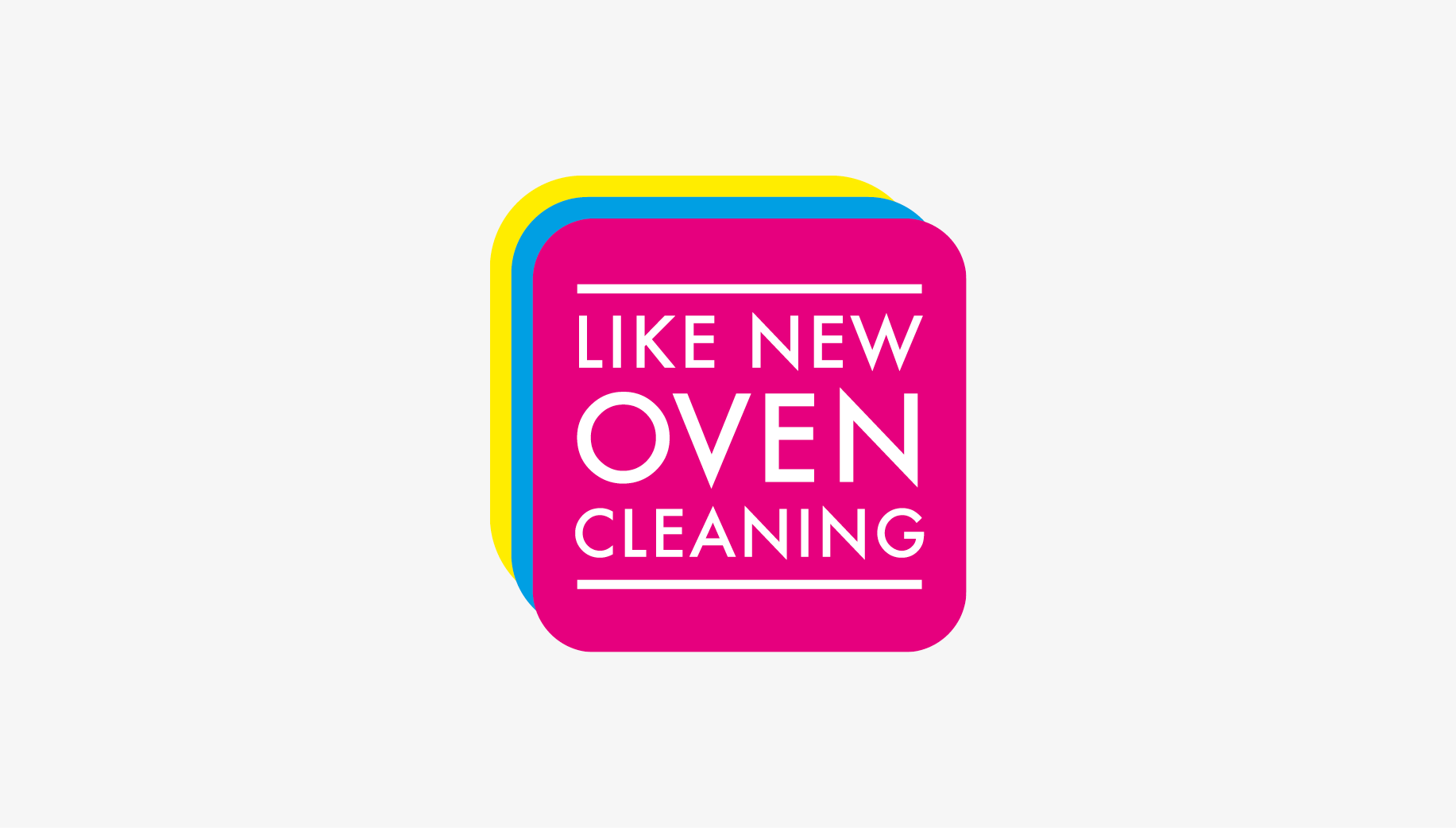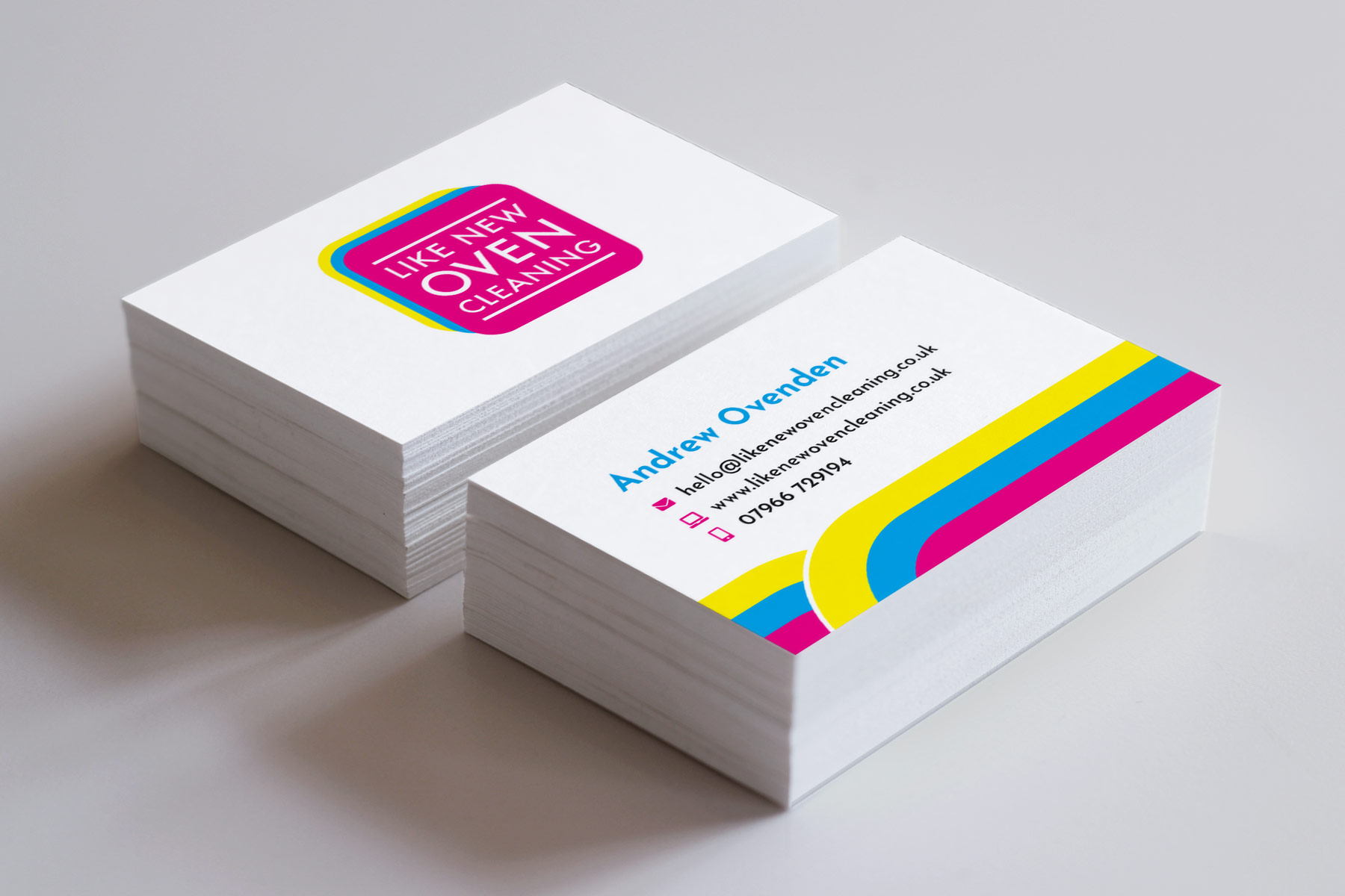

Logo design for Like New Oven Cleaning, professional oven cleaners in Brighton & Hove. Company director, Andrew wanted a visual identity that was bold, colourful and eye catching, and something that stood out from the crowd. The logo design utilises the 4 print colours of CMYK (cyan, magenta, yellow and black) which company director, Andrew has always been fascinated by. The colours work well to create a vibrant and rich colour palette that allows the company to jumps out. The typography sits between two horizontal lines, the universal symbol for an oven, and sits on top of a magenta square with rounder corners portraying an oven. The repeated squares in cyan and yellow create a feeling of energy and further enhances its ability to stand out from the crowd by introducing additional colour.


