
Home page
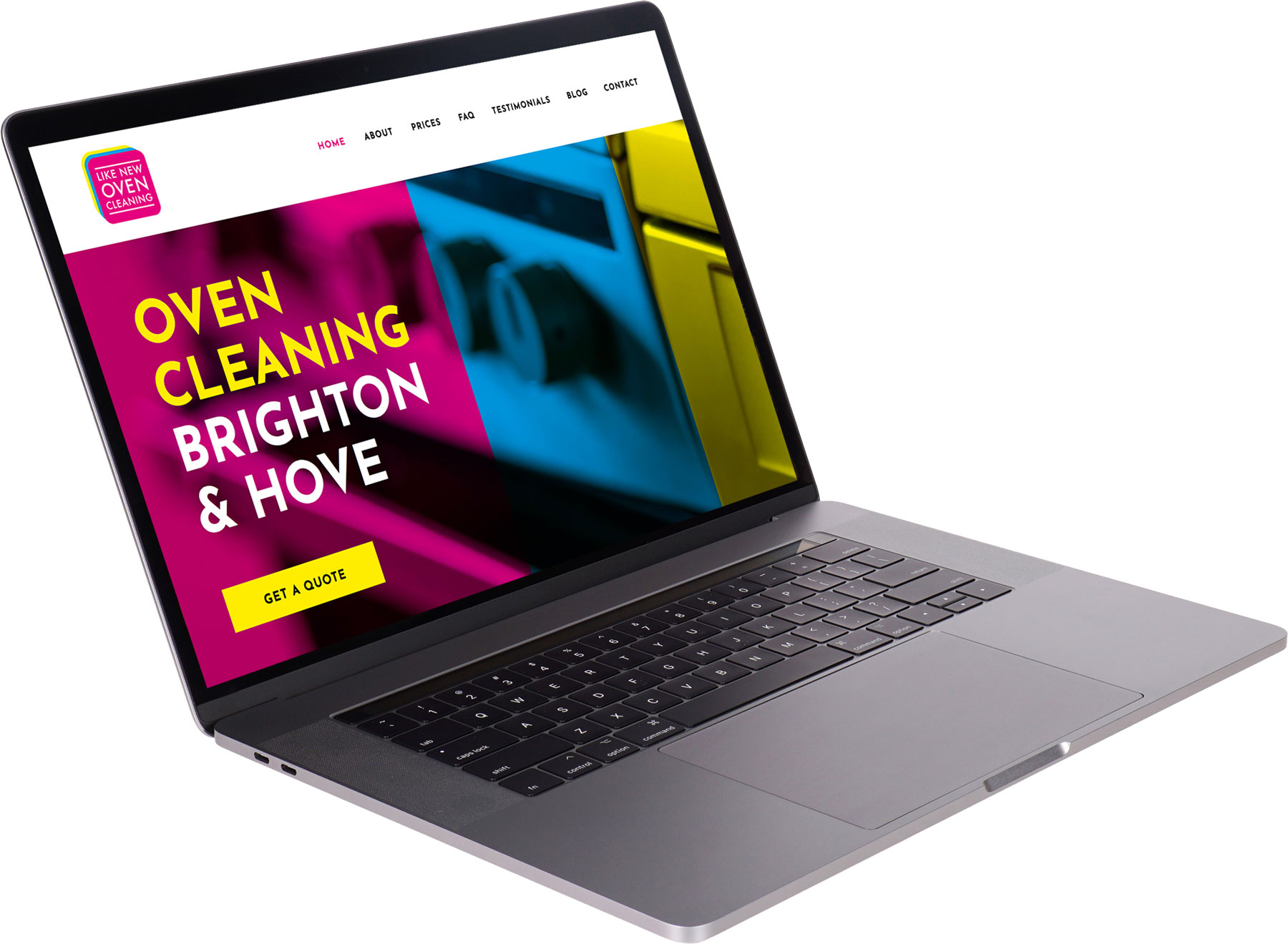
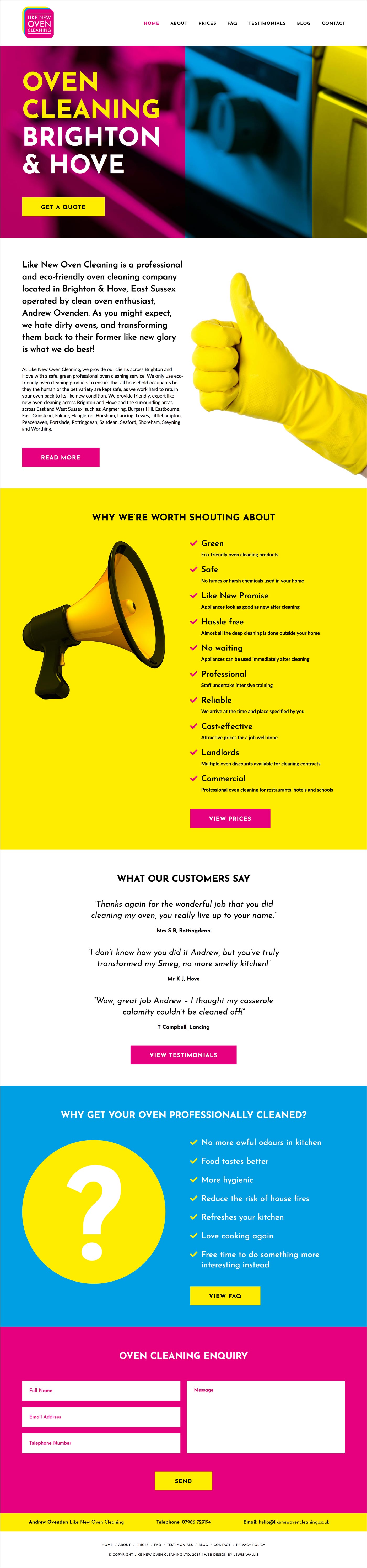
Brighton & Hove based professional oven cleaners ‘Like New Oven Cleaning’ required a logo and website for their recently registered company. The director of the company was interested in using attention grabbing colours and specifically mentioned his fascination with the little coloured squares seen inside the gutters of newspapers. I explained to him that those colours were the 4 print colours; CMYK: Cyan, Magenta, Yellow and Key (black) and knew they would be a strong foundation for the look and feel of the companies visual identity. After receiving high praise for the logo design (which you can see here), this quickly gave birth to a bold and colourful website using the same 4 colours: Cyan, Yellow, Magenta and Black. The website’s home page has a brief overview of each of the site’s pages and features large bold buttons throughout to allow users to visit the page and read more. The CMYK theme is also carried through into the images that feature at the top of every page, adding additional visual interest as well as creating a visual break between elements. To view the live site click here.
