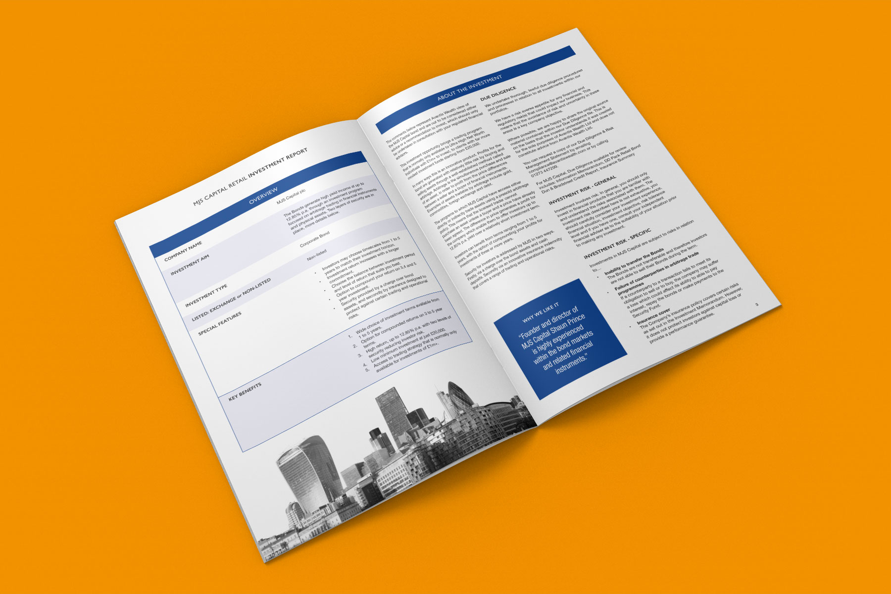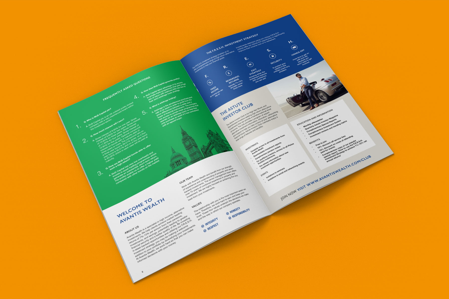


As part of the rebrand for investment broker, Avantis Wealth, a clean and simple approach was utilised to transform the often text heavy documentation into something stylish and essentially more readable. Generous, large imagery of modern architecture or modern building interiors were favoured to portray a feeling of ‘freshness’ to reinforce the brand’s FRESH investment selection criteria. Avantis Wealth also wanted to move away from their origins of being a red dominant brand, to a blue sophisticated company. Colour plays an important role in conveying the appropriate message, red has connotations with warning signs and is therefore not ideal for an investment company. Blue on the other hand is the colour most associated with trust (according to a myriad of colour studies) and is therefore a far more fitting colour for this type of business. Orange and green were also added to the colour palette to compliment the blue whilst adding a feeling of energy and a sense of freshness.
Please also see the following pages to view the Avantis Wealth logo design and website design:
Avantis Wealth logo
Avantis Wealth website


